




Shopping Without Barriers: Designing an Accessible Checkout in 4 Hours
Assist-a-Cart is a high-fidelity web prototype designed to make online shopping accessible for users with visual and motor impairments, built in just 4 hours for a national web design competition with its theme on inclusivity. The design placed 10th out of 81 participants at SIKAPTala 2026 Web Design Competition.
Abstract
Standard e-commerce platforms assume full vision, steady hands, and rapid decision-making. For users with visual or motor impairments, this creates daily friction — low-contrast text, cluttered category pages, small tap targets, and multi-step checkout flows that demand precision and speed. Designed in just 4 hours for a national web design competition with its theme on inclusivity, Assist-a-Cart is a high-fidelity web prototype that reimagines online shopping for users with disabilities. By prioritizing large-target filtering, intuitive button feedback, simple item navigation, transparent product specifications, streamlined checkout, and centralized profile tracking, the design proves that accessibility-first decisions create better experiences for all users.
Problem Statement & Background
The Challenge
How might we enable users with visual and motor impairments to browse, select, and purchase products independently?
Visual Impairments: Low-contrast text, cluttered category pages, and missing hierarchy make scanning impossible. Screen readers struggle with illogical button labels. Users with low vision or color blindness often abandon carts when they cannot verify selections or distinguish status indicators.
Motor Impairments: Small filters, precise swipe gestures, and dense product grids require fine motor control that many users lack. Accidental taps lead to lost carts and repeated effort. Multi-step forms with timeout pressure create anxiety and abandonment — especially for users who need more time to verify inputs.
Design Strategy
Intuitive Button Responses: Subtle scale-down on press and color inversion on active states. Generous padding, rounded corners, and raised shadows improve target visibility.
Simple Item Navigation: Vertical single-column layouts replace multi-column grids to maximize preview sizes, increase text readability, and eliminate accidental adjacent taps.
3D Product Measurements: Displays dimensions (size, weight, capacity) as spatial measurement bars instead of dense text, providing instant clarity for low-vision users.
Streamlined Checkout: A two-step process (Review → Confirm) utilizing auto-populated saved data and large payment method tiles to avoid nested dropdowns.
Activity & Purchase Tracking: Vertically stacked profile hub displaying large thumbnails and high-contrast status labels ('Received', 'Pending') for clear visibility.
Typography & Colors

Methodology
- Conducted a rapid heuristic analysis of common e-commerce accessibility barriers, focusing on cluttered layouts, tiny tap targets, and multi-step checkouts.
- Developed high-fidelity prototypes in Figma whitelisting WCAG 2.1 AA compliant standards, such as large touch targets and high-contrast color palettes.
- Refined linear checkout transitions and interactive component micro-feedback, validating user flows against visual and motor constraint heuristic models.
Results & Discussion
The Assist-a-Cart prototype delivers a clean, intuitive accessible shopping experience, proving that ruthless prioritization under time pressure can yield immediately usable design solutions.
| Features | Key Component | Solution |
|---|---|---|
| Filtering & Discovery | Large-target category filters | Large-target category filters with persistent chip states and instant visual feedback |
| Product Browsing | Vertical card stacks | Vertical card stacks with single-column layout, eliminating accidental adjacent taps |
| Product Details | 3D measurement visualizations | 3D measurement visualizations and plain-language specs for spatial clarity |
| Checkout Flow | Two-step quick checkout | Two-step maximum checkout process with saved addresses and multiple payment options |
| Profile & Tracking | Centralized hub | Centralized order history, searchable purchases, and high-contrast status labels |
Accessibility is about subtraction, not addition. Under time pressure, I decided to move away from carousels, dropdowns, multi-step forms, and decorative elements. What remained was cleaner for every user.
Feedback is non-negotiable. Every button press must answer the user silently: 'Did that work?' In 4 hours, I invested time in different states of components as well as descriptive texts to guide the user.
Saved data and product specifications are vital accessibility features. Auto-populating inputs prevents repetitive typing, while clear, distinct spatial dimensions eliminate the motor and visual strain of complex product descriptions.
Conclusion & Next Steps
Assist-a-Cart demonstrates that inclusive design does not require unlimited time or resources. By focusing on the six highest-impact interactions, such as filtering, navigation, product clarity, checkout efficiency, payment flexibility, and profile tracking, the prototype delivered an accessible e-commerce experience in just 4 hours.
The 10th-place finish out of 80 competitors validates that accessibility-first decisions, made with empathy and restraint, can compete at the highest level.
Future milestones include conducting moderated usability walkthroughs using the Figma prototype, refining interactive states based on simulated motor tremor testing, and exploring other high-contrast component libraries.
Skills & Frameworks
Explore Other Case Studies
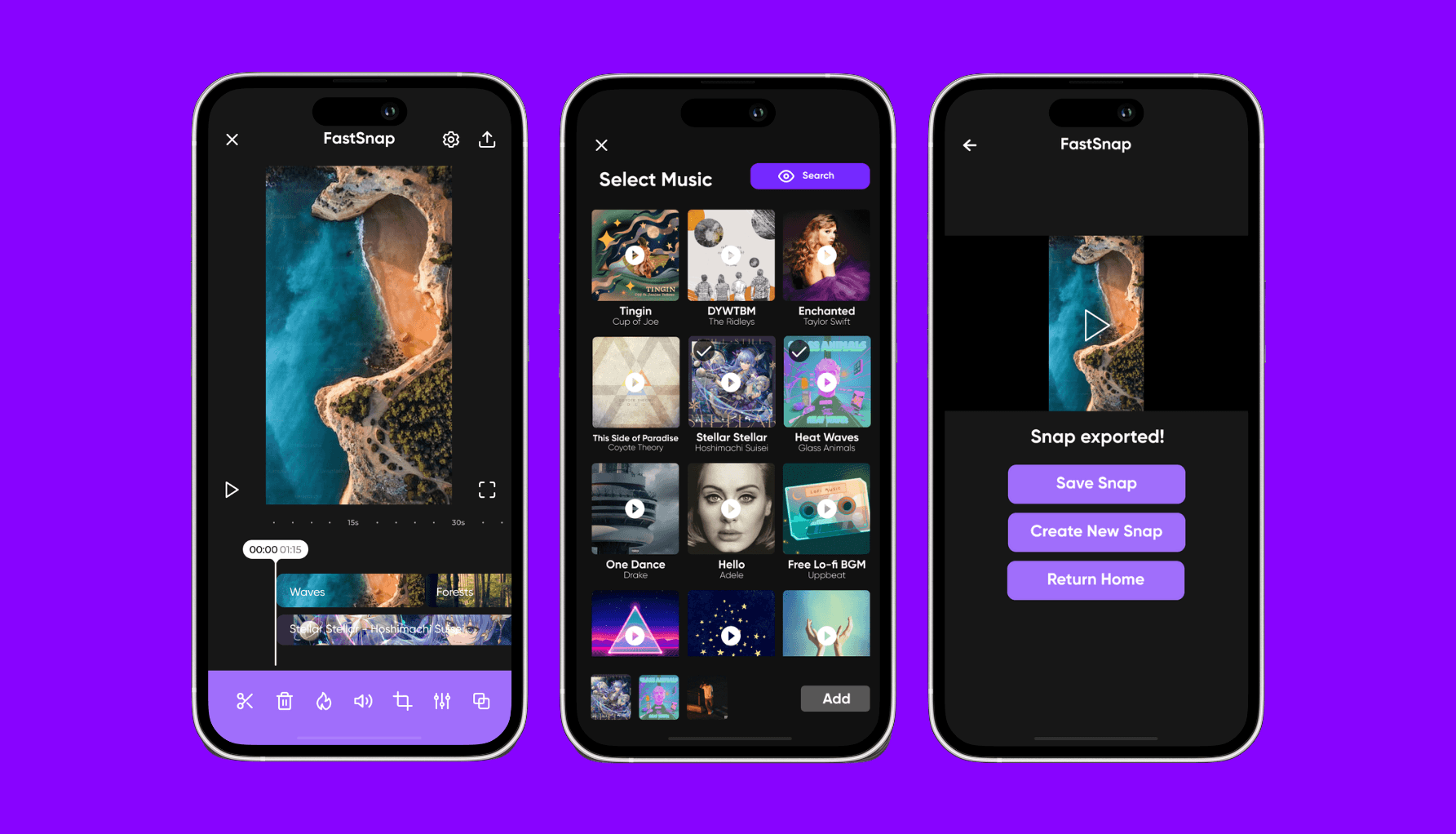
Streamlining the Workflow: Evaluation of InShot and FastSnap as a Prototype in Optimizing Video Editing Experience of College Students
FastSnap is a mobile video editor prototype made using Figma. It is designed to offer an intuitive user experience for users who edit videos on the go.
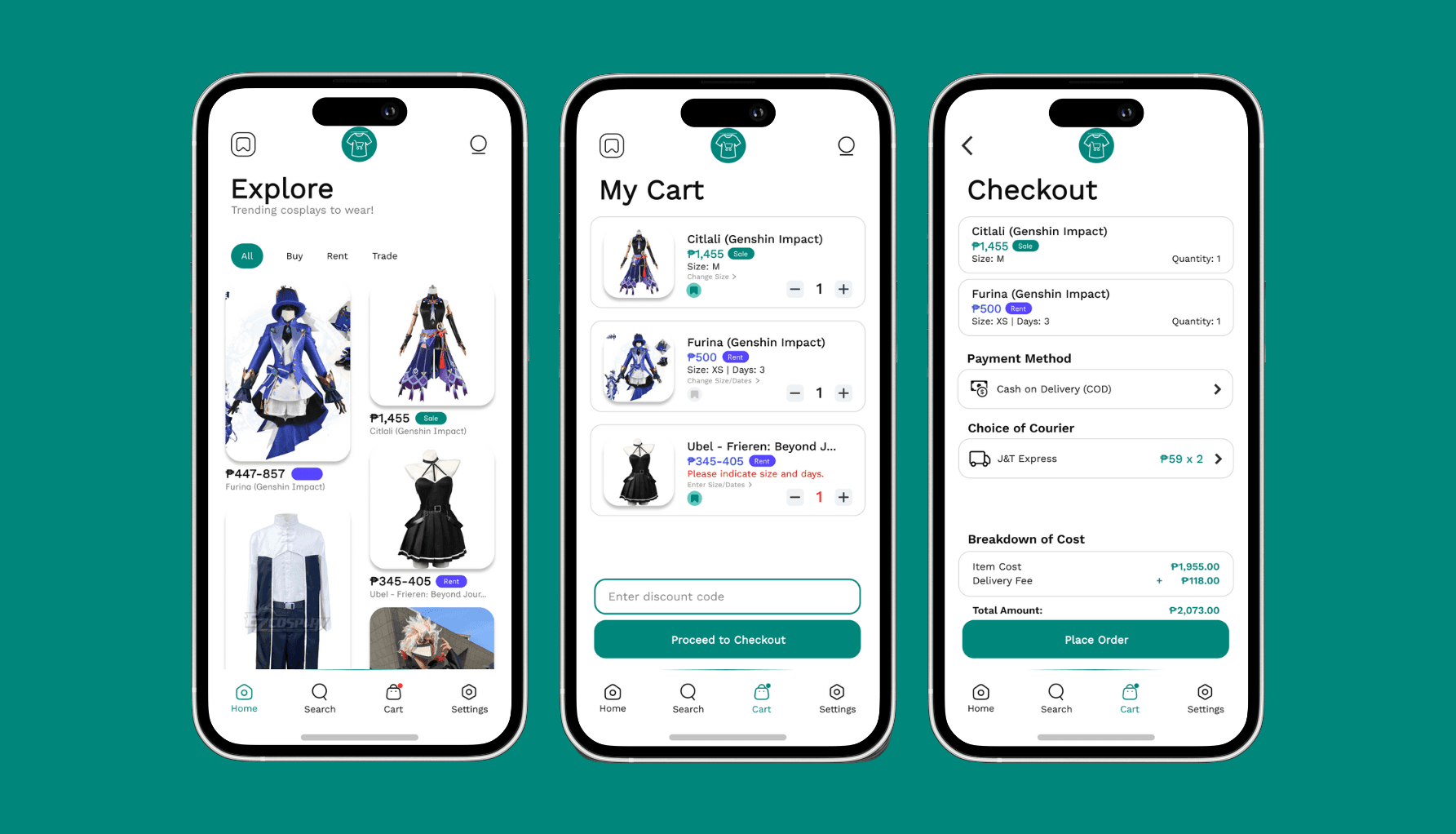
Establishing a Reliable Marketplace Platform for Cosplay Products in the Philippine Community
CosMarket is a mobile e-commerce application prototype designed to revolutionize the cosplay community by offering a seamless, secure platform for buying, selling, and renting cosplay outfits and accessories.
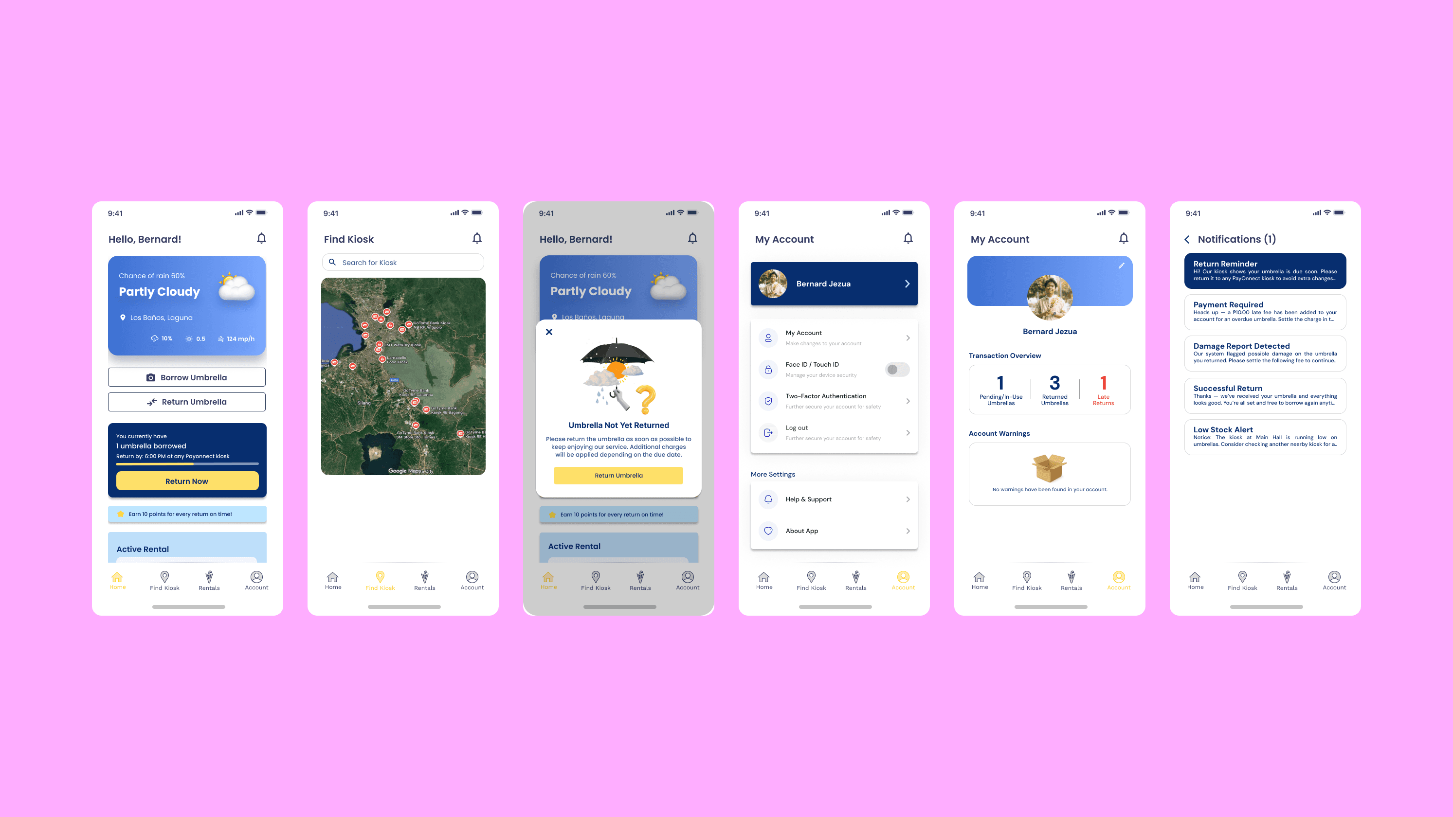
Design and Viability of Payonnect as a Sustainable Smart Umbrella Sharing Kiosk Network
Payonnect is an eco-friendly mobile application and kiosk sharing prototype that allows commuters to borrow and return umbrellas through QR codes, providing immediate shelter during unexpected weather.